Harvard’s Nieman Lab blog posted a few presentation videos from Webstock (said to be like SXSW meets TED, or “annual New Zealand conference brings some of the web’s luminaries together to talk about web publishing and technology.”)
Sure, each of these topics deserve research in their own right: Designing for the iPad, using analytics data, understanding attention, and creating delight.
The most important one to me is Creating Delight. The other stuff is details. Creating delight is summarized by Dana Chisnell as giving users Pleasure, Flow, and Meaning. This is what makes consumers giddy over Apple products. Apple already shows how it’s done, yet imitating competitors still can’t replicate how it’s done. In part, it’s because it’s possible to replicate without understanding the elements, or secret sauce, that the original developers understood. Android is a horrid experience and more and more people are switching to iPhones, as evident by how many text messages are returned to me in blue (iPhone’s iMessage) vs green (standard text message to other phones).
See, replicating or reverse engineering, call it whatever you want, is a much more drone process than inventing. You lose a bit of humanity, a bit of soul. (see section on China, Pessimistic Determinate) Trained as an engineer, I understand many engineers who develop the popular devices and apps are the logical sort, which explains why even the most popular site Facebook “feels” dry. Lacks personality. Or in Dana’s words, Facebook’s usage itself doesn’t provide “pleasure”…the pleasure, if any, requires friends who post something intriguing. Neither does Quora. Thinking of using Quora makes me cringe.
This isn’t just about the UI (user interface), i.e. the design, icons, color, and mobile finger gestures. The UI is the outward appearance, what I love to work on. But as we’re doing with DEUCI, seamlessly integrated “flow” experience is designed from the ground up. Everything from server hardware performance to database structuring matters, not just the appearance. Otherwise it’s like dressing a weak skinny kid in Brad Pitt’s suit. The suit’s appearance looks ok, but without the body structure, looks, and even life experience, it’s no Brad Pitt.
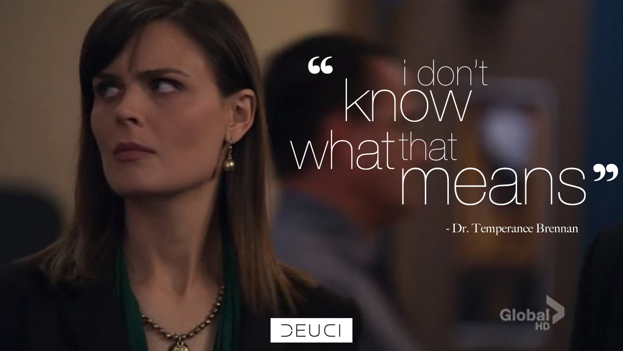
But a weak skinny kit in Brad Pitt’s suit may be all an engineering nerd can come up with. Because that’s what he or she is. Which makes the design method “what would you do if you were the user” useless. I’m sure gadget and app designers ARE doing that. They’re just not in touch with the mainstream culture and experience. Think Bones’ Dr. Brennan (Emily Deschanel’s character). She says “I don’t know what that means” all the time, in response to a pop culture or mainstream reference. I don’t know if this can be solved by having a diverse team where some are purely logical engineers while others are creative like, marketing creative. Or, it requires unique individuals who are both logical and creative with a attractive personality, in one person.
I don’t have time to get into it all, so here’s Dana Chisnell’s presentation video. She goes over some good points about designing for a human experience. I don’t agree with some of her conclusions from her examples, but they’re good case studies to just consider.
http://vimeo.com/38140672
Continue Building Your Personal Brand with Our Best Tips. FREE.
Join our free newsletter for our best tips and strategies to become a superstar online. Whether if you're a blogger, coach, musician, or youtuber, you can take charge of your dreams. Use our insights and gems from years of consulting clients, corporations & celebrities.


