Your website’s design IS your internet presence. A friendly, aesthetic (well groomed) and professional design will impress upon people those same qualities about you. That’s why I share many of the WordPress Themes I’ve used for clients on this blog as examples of good designs.
Many of the designs I share with you are premium WordPress themes, meaning WordPress themes you buy. Is it worth paying $45-$75 for a stunning professional theme design? Alternative: paying a designer several thousands to put the same thing together for you? Absolutely worth it.
But, how do you “Shop” for the right design when exploring the theme demos?
Having coded and designed many WordPress themes myself, this is how I break down a WordPress theme when I select designs for clients who just want to buy a theme.
WordPress Theme “Designs” Do 2 Things
1. Layout. Like a magazine or newspaper, how are content areas laid out? Areas such as: menu, header picture, post title, main content, sidebar for links or widget apps, and footer.
2. Functionality. The basic functionality of WordPress is quickly publishing articles, aka Blogging. But as you know WordPress can be extended to be a Wiki, forum, events manager, or even your own social media site using BuddyPress. Some of these functions, including fancy social media sharing buttons and picture galleries, may be included in a theme or installed separately as plugins. If a theme has a lot of functionality built in, test to see how well it works. It may be why a particular theme costs more or less.
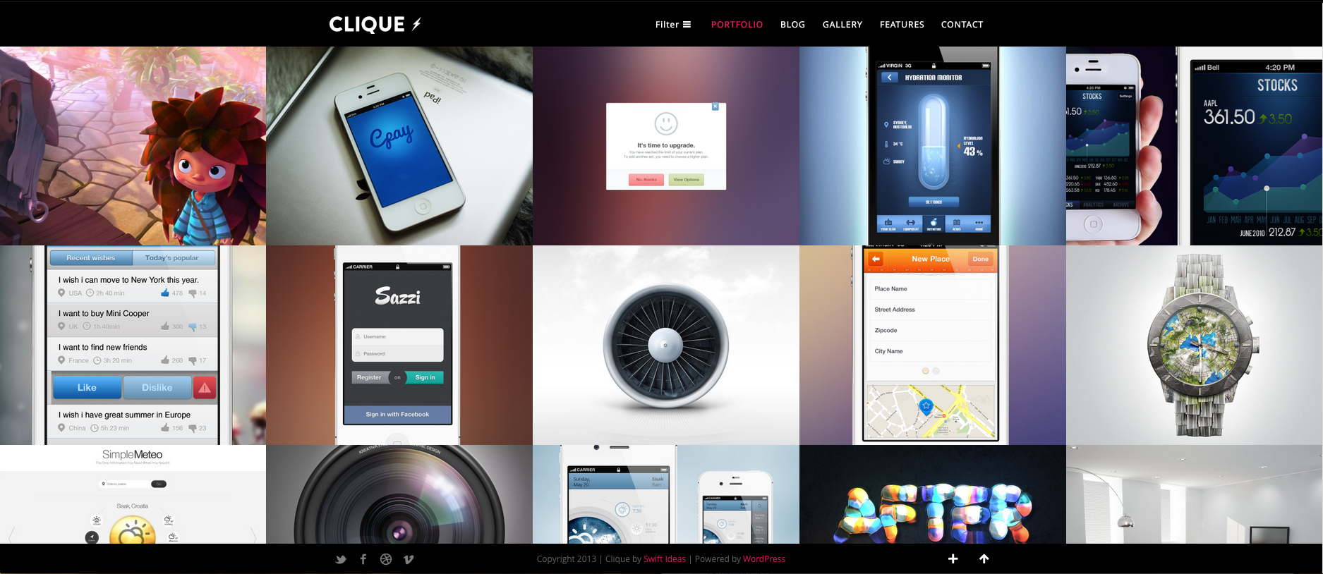
Step 0: See the Possibilities
Theme designers set up demo versions (live preview) of WordPress Themes to look the best and highlight their design. The designers do this by picking matching FONTS, COLOR PALETTES, and STOCK PHOTOS. With a different combination of fonts, colors, and your own photos, the same theme may look quite different on your own site. The longer you’ve had your own WordPress website and the more WordPress themes you’ve tried on, the better sense you’ll have of this. If you’re just starting, don’t worry. That’s what I’m explaining in this post.
So what should you be looking for?
As I take you through the different aspects and layouts of WordPress themes, pay special attention to the experience. Think of it like test driving a car, or walking through a house.
- How easy is it to find what you’re looking for?
- Are areas too cluttered or too empty?
- Are all the elements you need, such as the menu or tags, available and accessible?
- Do fancy features, like animations or scrolling cause problems?
- If you installed this theme, would your visitors enjoy the experience on your site and easily find what they’re looking for?
The design is as much about usability as it is about aesthetics. Imagine yourself as a visitor to your own site. If not, move on to the next theme. In fact, test drive demo versions of as many themes as you have time for. That’s the best way to compare and get a sense for good vs. bad designs.

Step 1. Ignore the Flashy Stock Photos
Ignore the flashy stock photos and imagine your own pictures in it’s place. Pictures make a world of difference to the quality of any website. The imagery you use on your site will set the tone. You should have at least some high quality photos or graphics to use at the top of your website, or as a background if the WordPress theme you select allows for a full-screen background. Photographers, designers, actors, and models have less to worry about as you should have high quality images to use.

Step 2. Don’t Worry About Fonts or Colors
Any WordPress theme you buy nowadays should include hundreds of fonts (from Google fonts) to choose from and unlimited colors. Fonts and colors can set the “mood” for any theme, so even if a theme demo looks “modern,” selecting a retro style font with grunge looking colors can turn that theme into a classic looking theme. Do pay attention to the theme description as to what colors can be changed and what can’t.


Step 3. Check the Layouts.
WordPress theme designers create layouts for different sections of a website. Use the menu to access each section, as you would on any website. Good designers will include all variations of each layout (such as sidebar on left or sidebar on right). I will list the common ones below and which sections to check for these layouts.
Homepage Layout.
The homepage conveys to the visitor what kind of a site you have. Browse under the top menu. There’s often several layout examples included in the demo to show you what each theme can do.
- Business and organization websites usually have a header picture or a slideshow at the top where the main products or services are showcased. Below are sections where you’ll include details of each service or feature.

- Blog and Magazine websites have homepages with several different content areas.

- Design, photography, and portfolio websites have homepages that feature various kinds of photo galleries for the artist to showcase their work. Written content areas are minimal as not to distract from the visual art.

Pages Layout.
Pages in WordPress allow you to add “informational” content instead of updated content like a blog. Pages are used for Company and Author profiles, pricing pages, signup pages, sales pages, and contact pages. Look for examples of how Pages layouts look under “About,” “Features” or “Contact” sections in the top menu.

Single Blog/News Post Layout.
Just click on the “blog” section in the top menu or click on any post title that looks like a link. This should take you to a single blog/news post. Don’t worry too much about the term “Blog.” A blog is simply a running archive of posts. A “Blog” can just as well be titled the “news” or “updates” section. Most single post layouts will be similar if not identical to pages layouts. Also, are there options to have the sidebar on the left, on the right, or no sidebar at all (i.e. “full width” layouts)?
Blog Category (Archives) Layout.
How are blog/news posts listed? This layout may be harder to find. Once you’re on a single blog/news post, either look in the left/right sidebars for “Categories.” Or, look for “filed under” links before or after the body of the post. Click on a category. This will bring you to the category archive where you’ll see how the posts are listed. Some WordPress themes will list posts in rows as most blogs look. Some themes will have the option of listing the posts in grids. Pay attention to whether images or thumbnails are a significant aspect of the layout. If images are important, will the types of images you plan to use go well with this layout?

Category Archive (Blog post list)

Portfolio Layout (for portfolio themes).
Look for how portfolio items are showcased in the portfolio layout. There are often several variations theme designers have included such as 2, 3, or 4 column layouts. Also, how is the navigation of portfolio items? Is it easy to browse through different portfolio categories (if that’s important to you)?

4. Extras
Depending on the type of WordPress theme you’re looking for (business & organization, blog, magazine, portfolio etc…) the extra functionalities included will be different. You’ll often find such extras included with each theme under the “Features” section in the menu.
**Caution: many of these extra features use WordPress shortcodes. I’d suggest you find free WordPress plugins that give you the same features instead of using the features that comes with the theme. I’ve written before that I frown upon using shortcodes, especially shortcodes that are tied to a specific theme.
Column Layouts
Allows you to split your text into several columns like a magazine. Most useful to break up space on the Homepage or informational pages.

Typography
Adds more variety to your content. Dropcaps make the first letter of a paragraph bigger. Blockquotes emphasize quotes. Heading sizes go from H1 (largest and most important titles/headings) to H6 (least important, rarely used).

Tabs & Toggles
Tabs and toggles show and hide one part of the content while showing another.

Pricing Tables
Nicely laid out tables showing features, prices, and buttons to allow visitors to select a particular option.

Maps.
Some themes include Google maps that can be inserted into contact forms or event listings.

Contact Forms
Contact forms included can range from a simple form asking for name, email, and feedback. More complex contact forms may include several customer service options and spam protection.

5. Mobile & Multiple-Screen Adaptive (“Responsive” Design)
As soon as you start looking for WordPress theme designs, you’ll see the majority now as “responsive designs.” Responsive layout designs are more complex designs whose layout “Responds” to different screen sizes. Meaning, there’ll be a slightly different layout for a regular computer screen view, then a different layout for a tablet or iPad view, and finally a compact layout for mobile and iPhone views. Because there are so many mobile devices out there and each with its own screen size, responsive layouts are becoming the standard so visitors using mobile devices won’t have to pinch and zoom their screens to see your website. Layouts automatically fit the screen as well as the vertical/horizontal orientation of the device.
You don’t need a mobile tablet, phone, iphone, android, iPad, Nexus galaxy, and thousands of other devices to test out responsive layout designs when shopping for WordPress themes. Simply make your browser window wider or narrower. If the WordPress theme has responsive design, you will see the design change (or “respond”) as you make your browser window more narrow. When your browser is at it’s narrowest width, that is the layout for a mobile phone such as the iPhone in vertical orientation.

Continue Building Your Personal Brand with Our Best Tips. FREE.
Join our free newsletter for our best tips and strategies to become a superstar online. Whether if you're a blogger, coach, musician, or youtuber, you can take charge of your dreams. Use our insights and gems from years of consulting clients, corporations & celebrities.


Pingback: Making Your Own Website: Choosing WordPress Themes with Good Bone Structure | DesignShop()